K S Architect is the brand we created for a talented young architect called Kiki.
| Concept |
After several months of development, we finally landed on a logo concept that both satisfied Kiki’s vision and the client’s design aesthetic. Kiki’s initial insistence on using bold square forms to create the letters K and S for the logo resulted in a “masculine-looking” design. While this design was in line with the client’s wishes, it did not fully represent the brief, as it did not reflect the client’s specific design aesthetic.
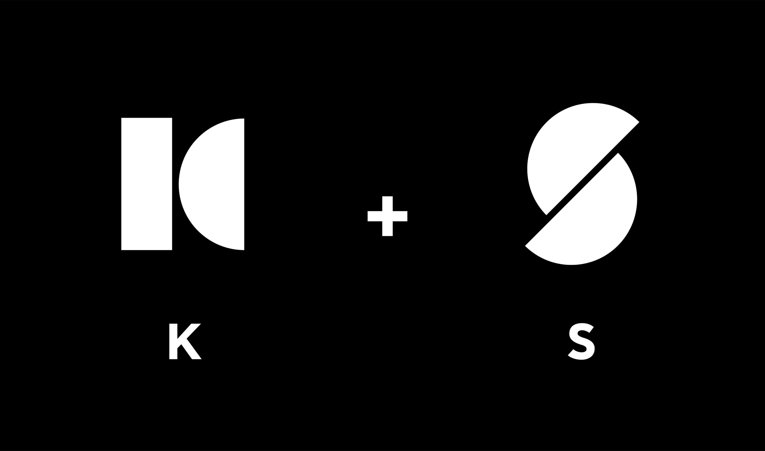
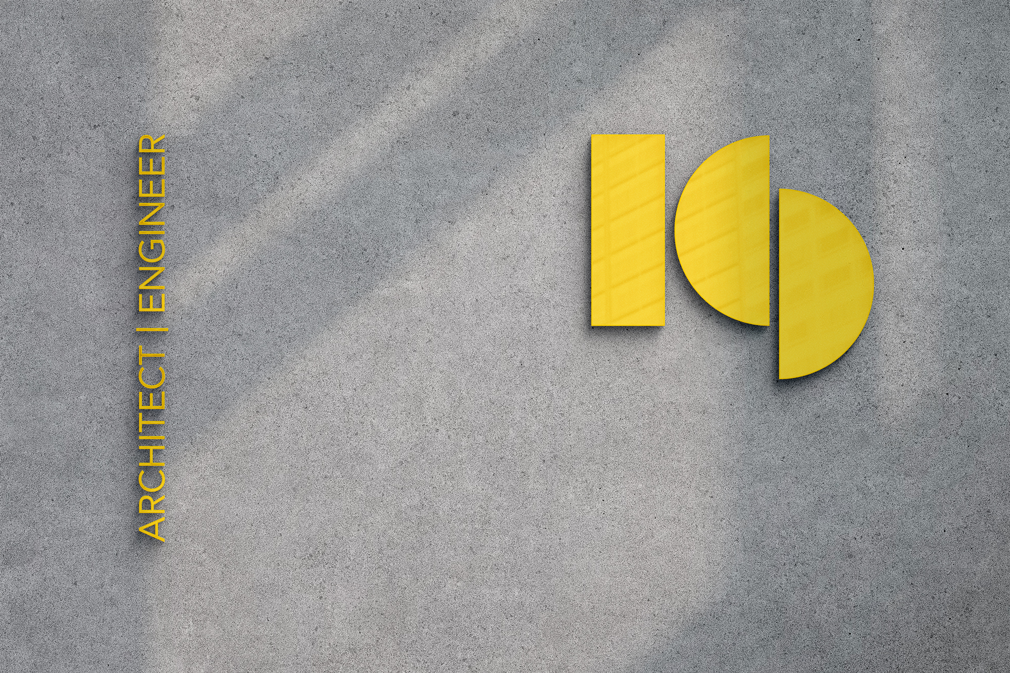
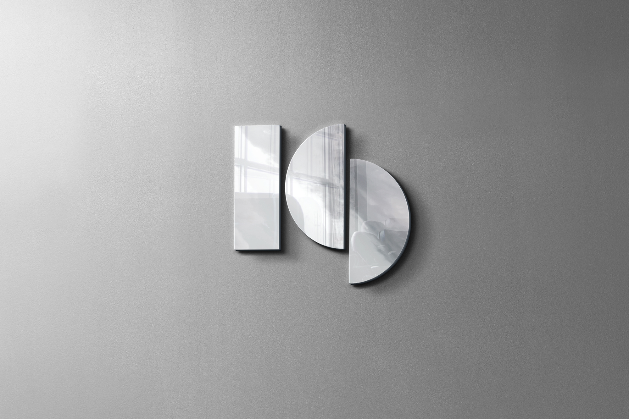
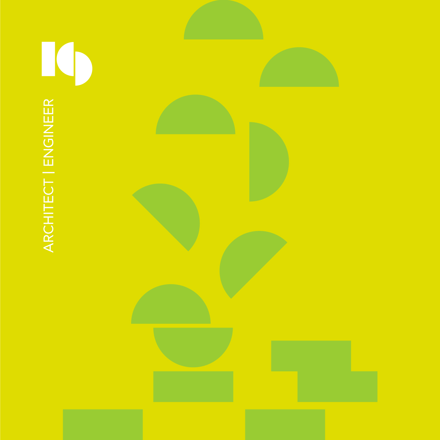
In order to better understand Kiki’s work and style, I took some time to familiarize myself with her previous projects before returning to the logo design. Ultimately, I decided to combine the letters K and S and have them overlap and share an element, in the case a semi circle. This represents innovation and creativity. This resulted in a rectangle and semicircle for the K and two semicircles for the S, resulting in a design that accurately matched the client’s desired aesthetic. This new direction even helped Kiki see her work from a fresh perspective.
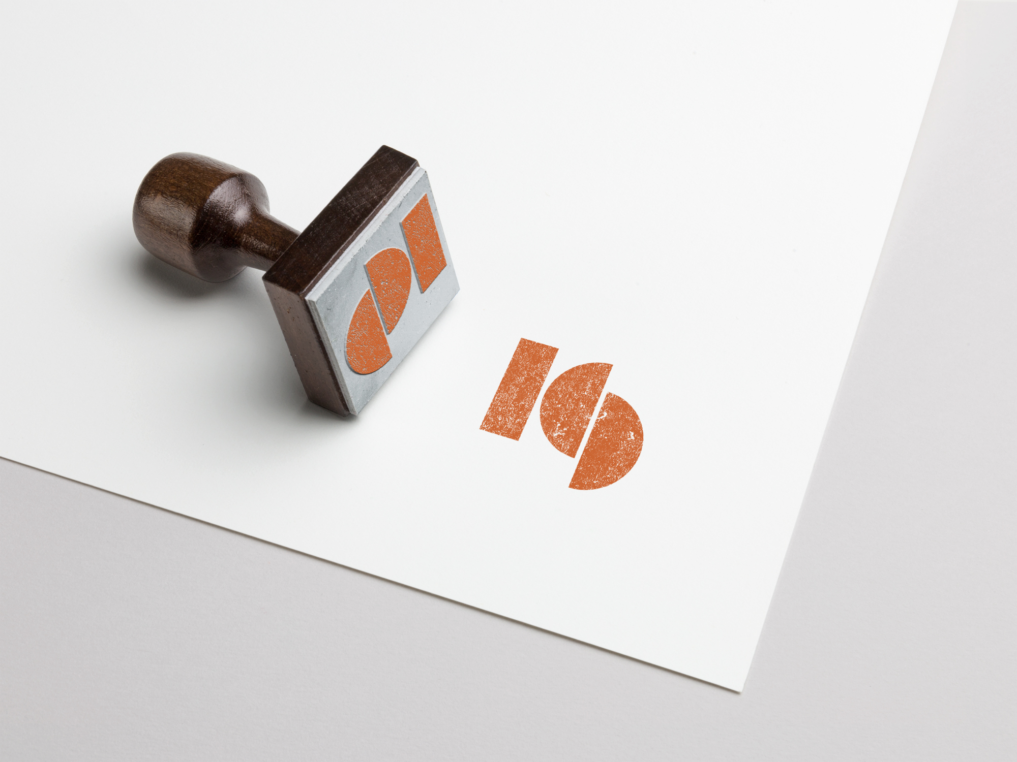
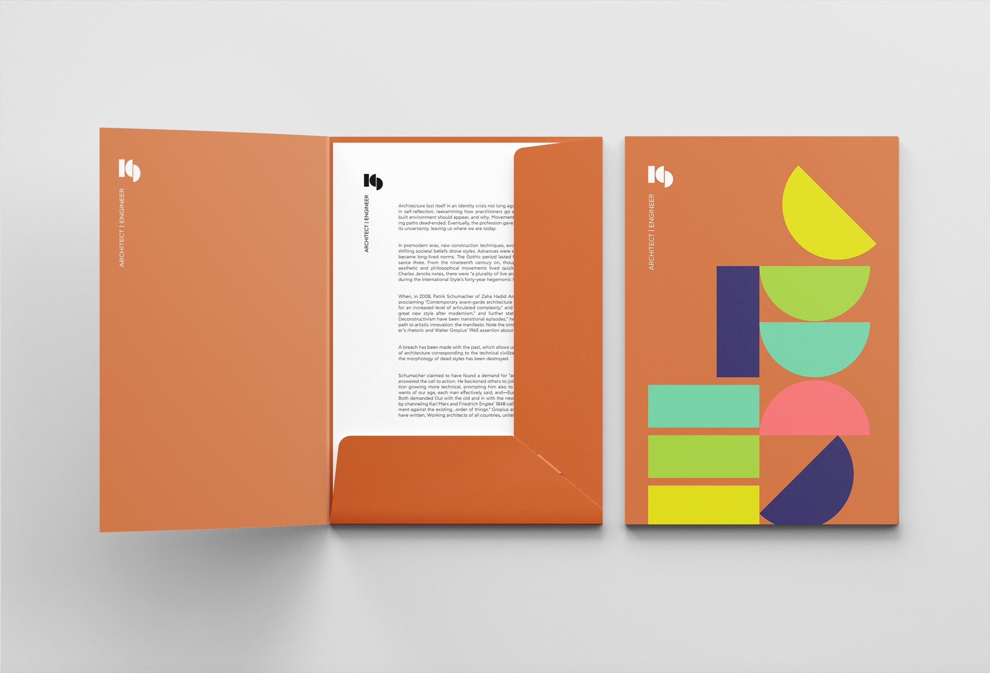
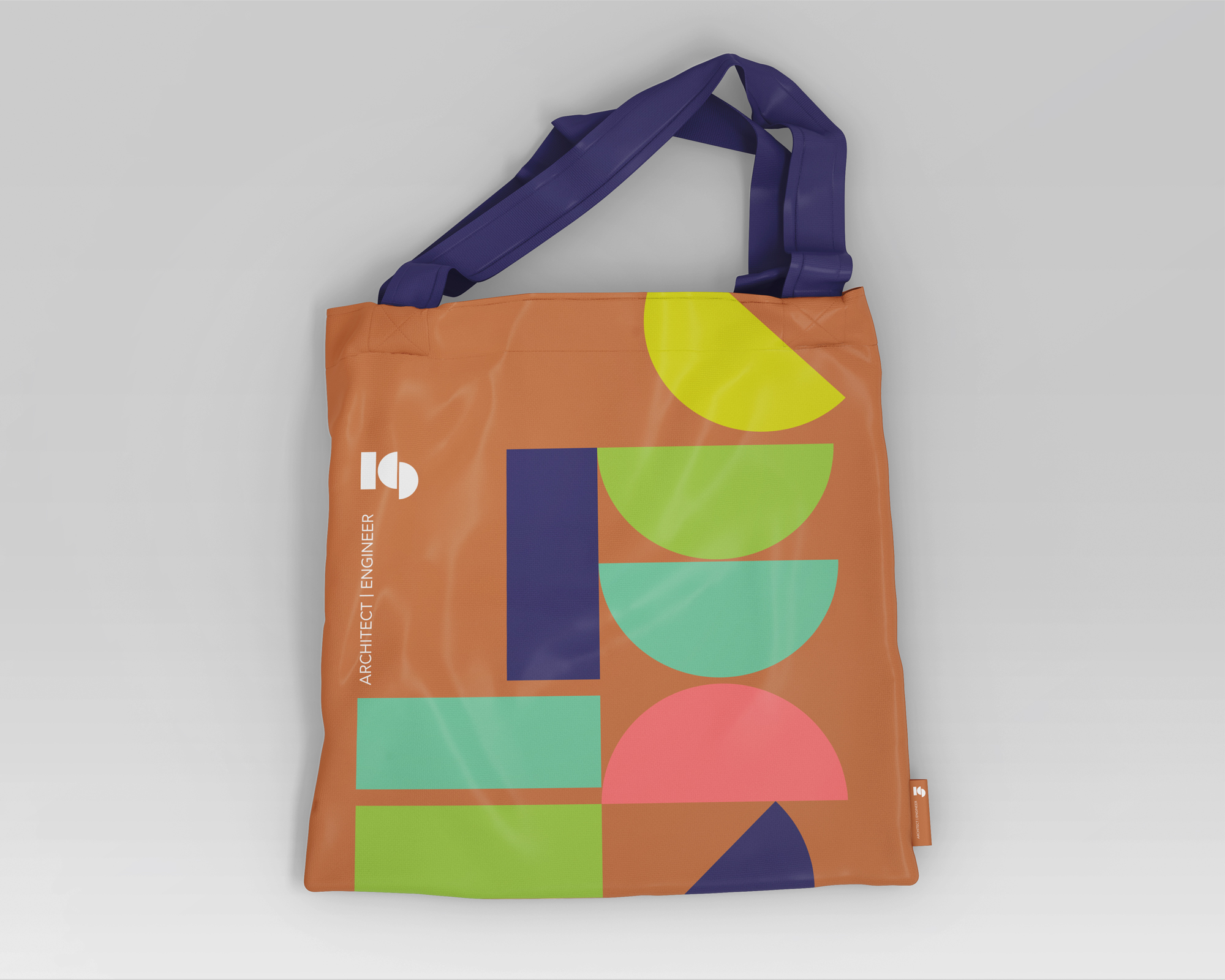
To ensure maximum versatility, we experimented with different color palettes and deconstructed logo elements creating some visual interest. We settled on black and white for printed applications. To complement the logo, I chose a clean, sans-serif font that could be used in both Greek and English. We’re thrilled with the final result, and believe it effectively captures both Kiki’s style and her vision.
| Design work produced |
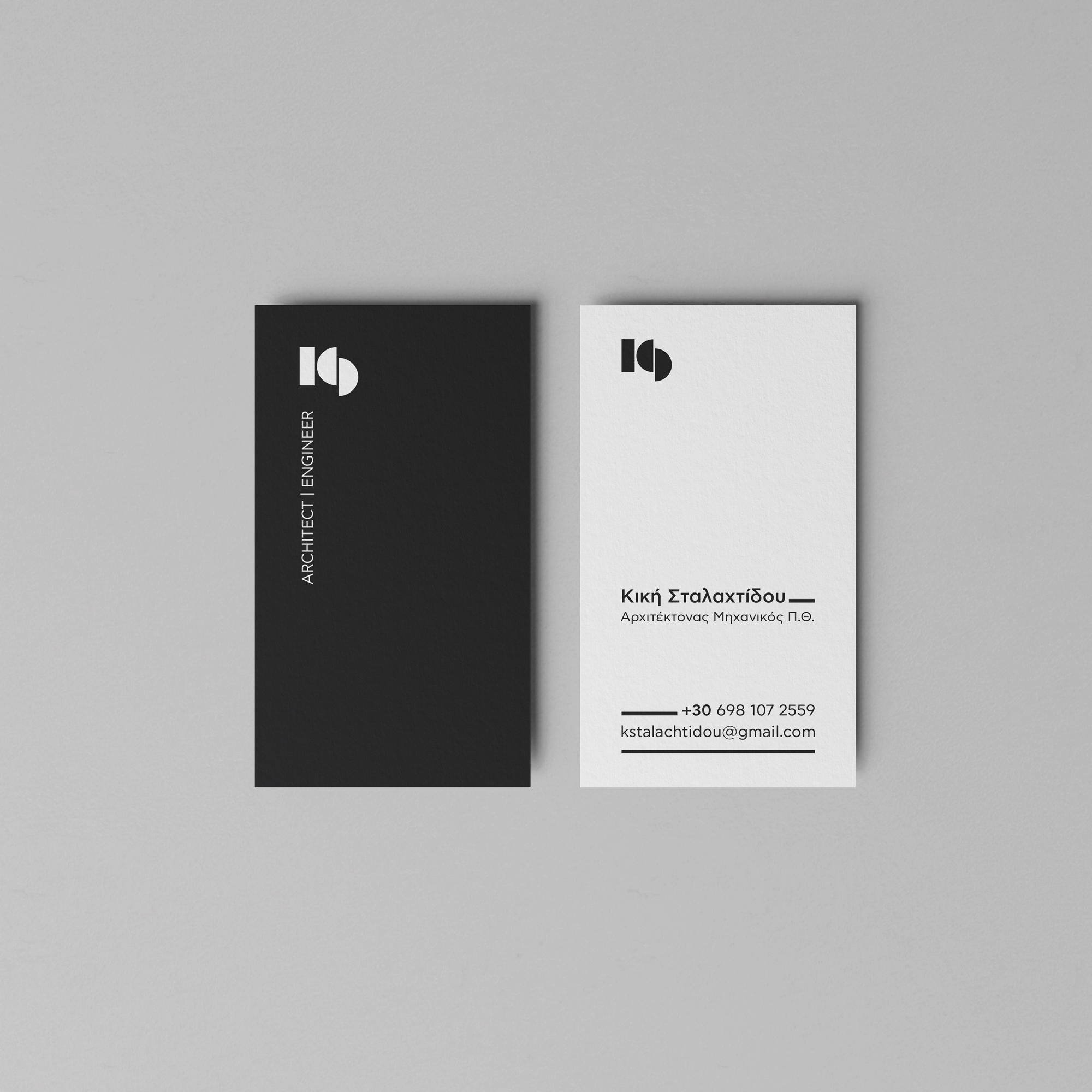
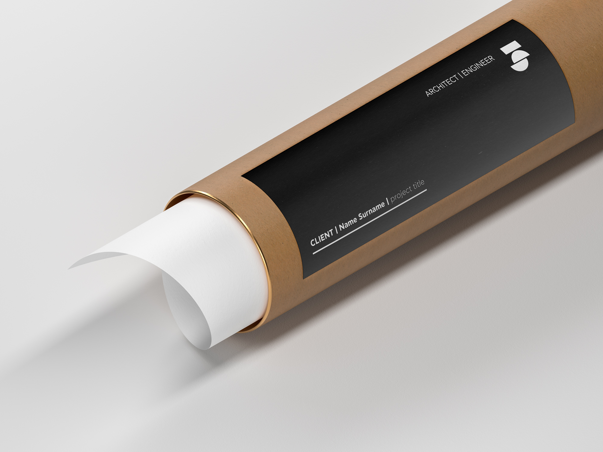
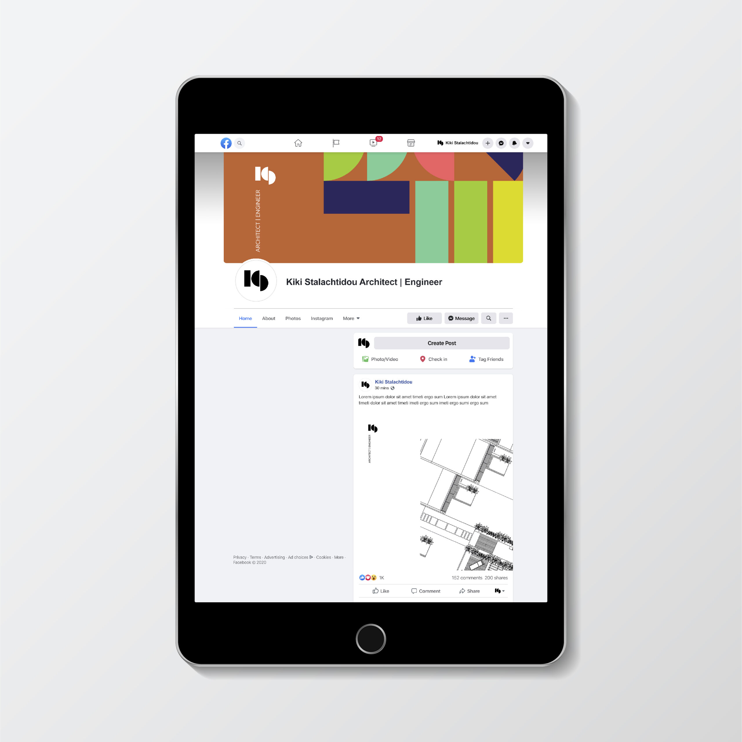
– Logo design – Business card design – Outdoor | Indoor signage